Local Architecture & The Natural Landscape
Introduction
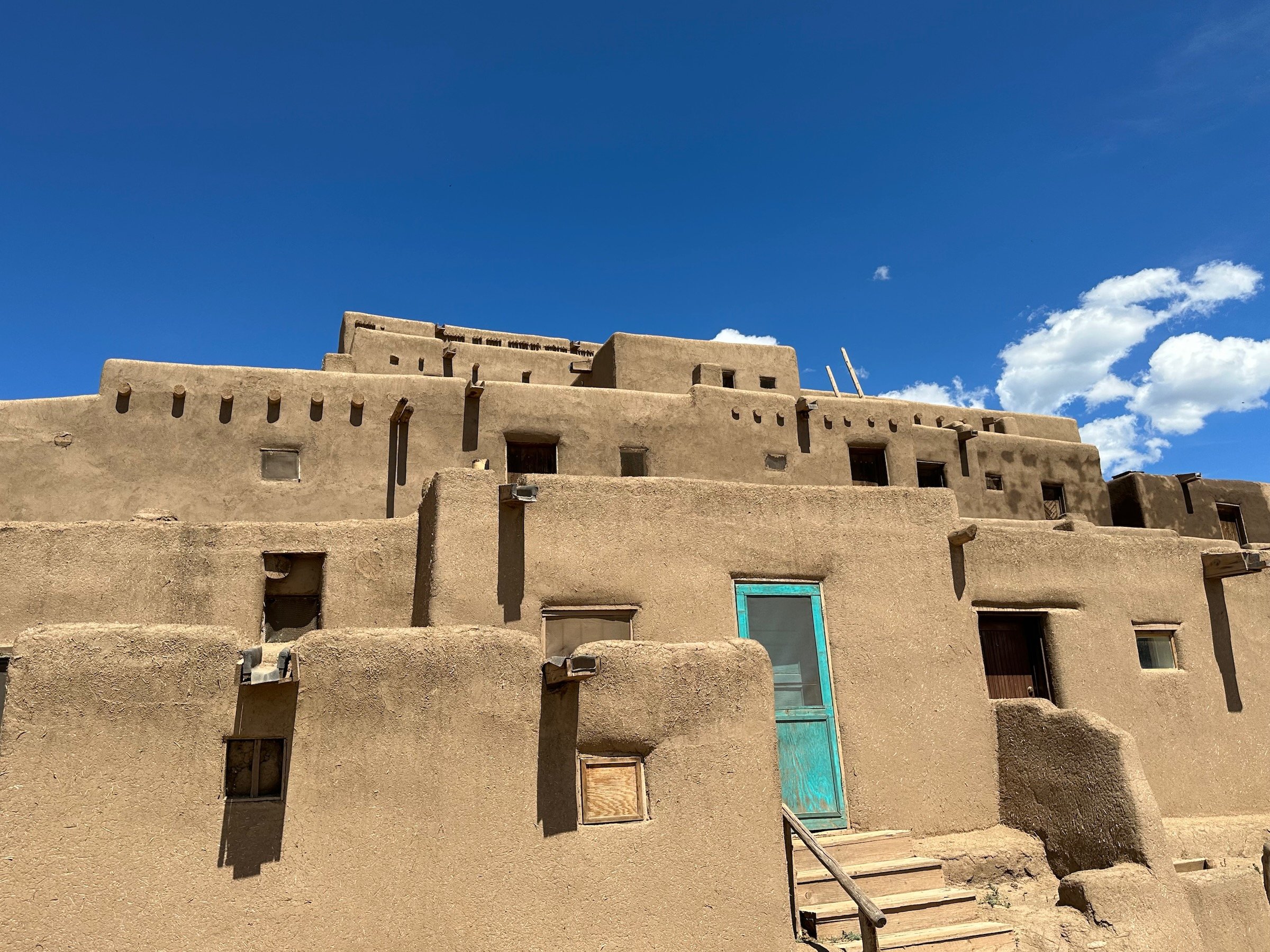
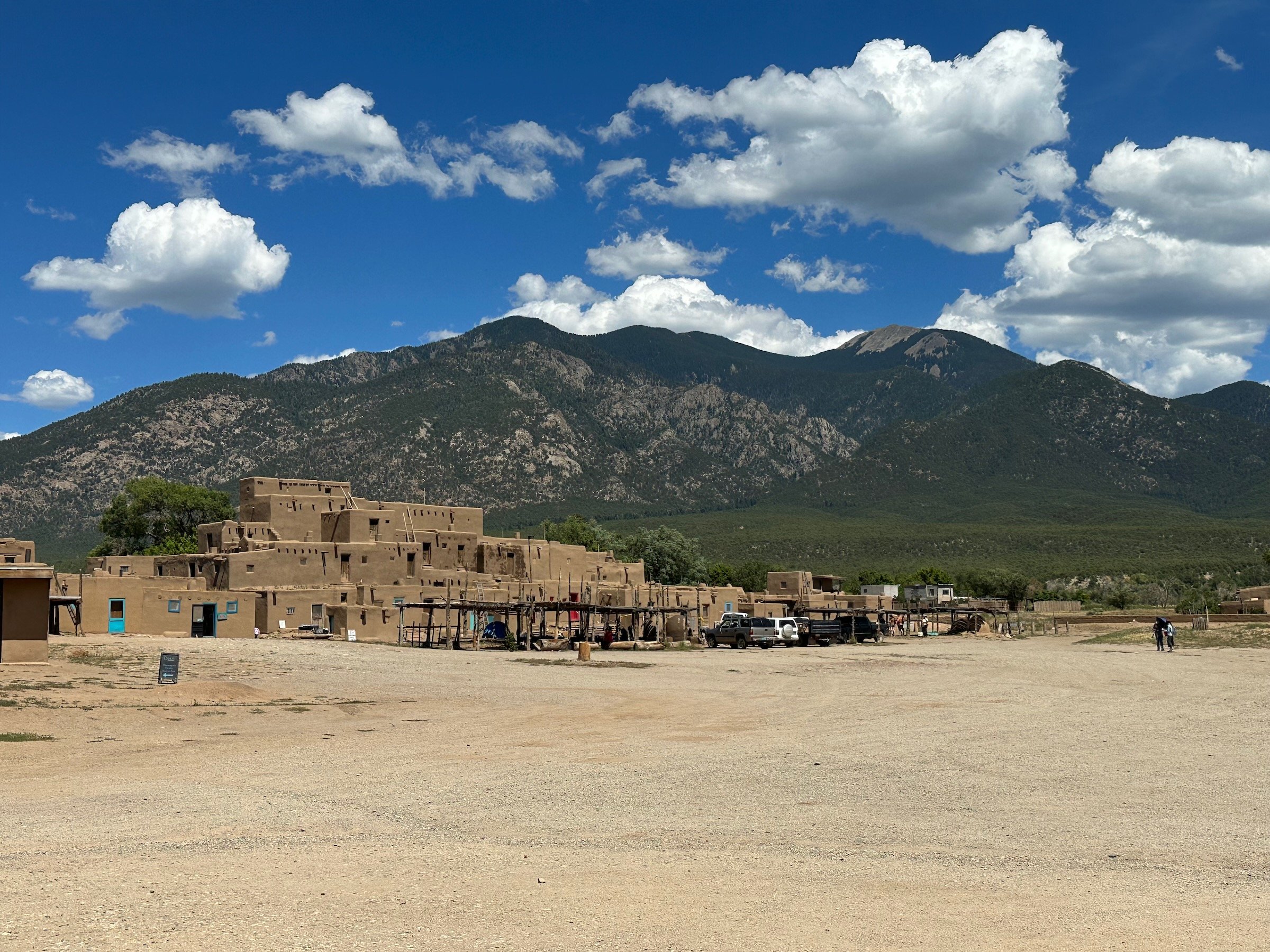
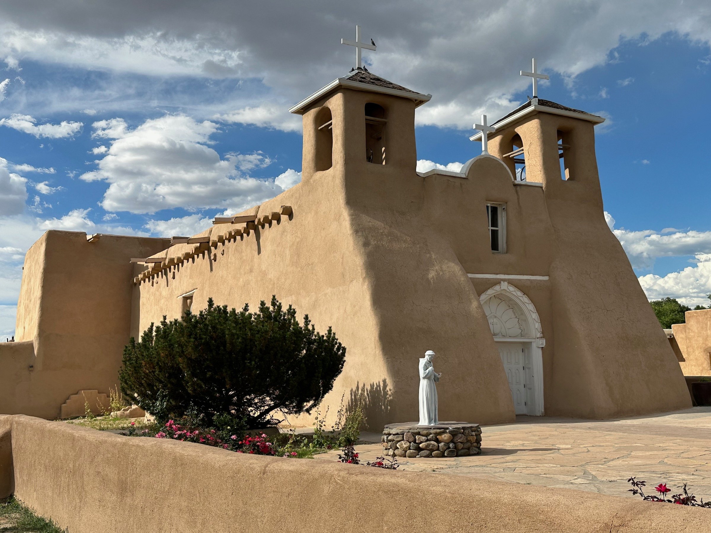
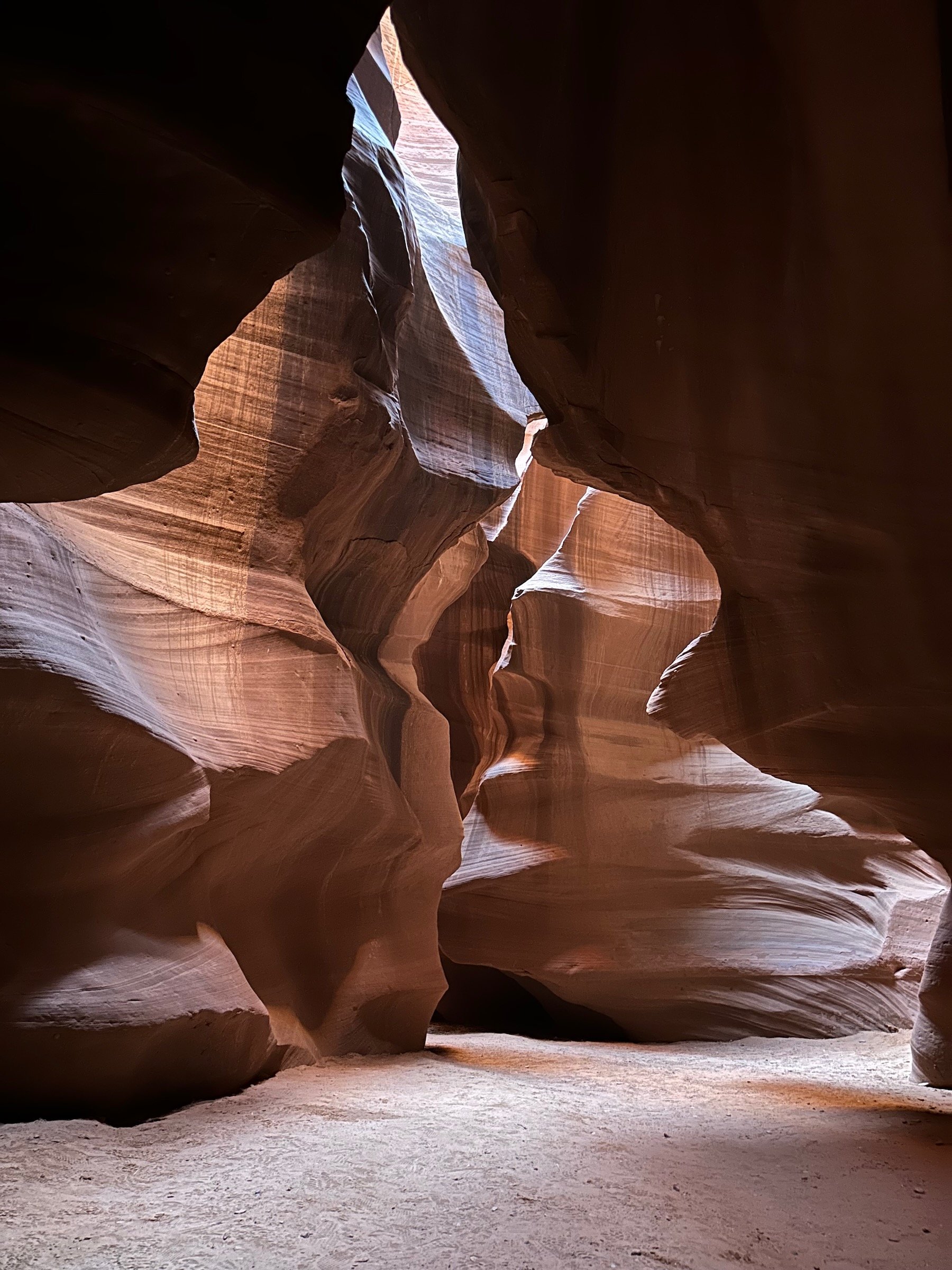
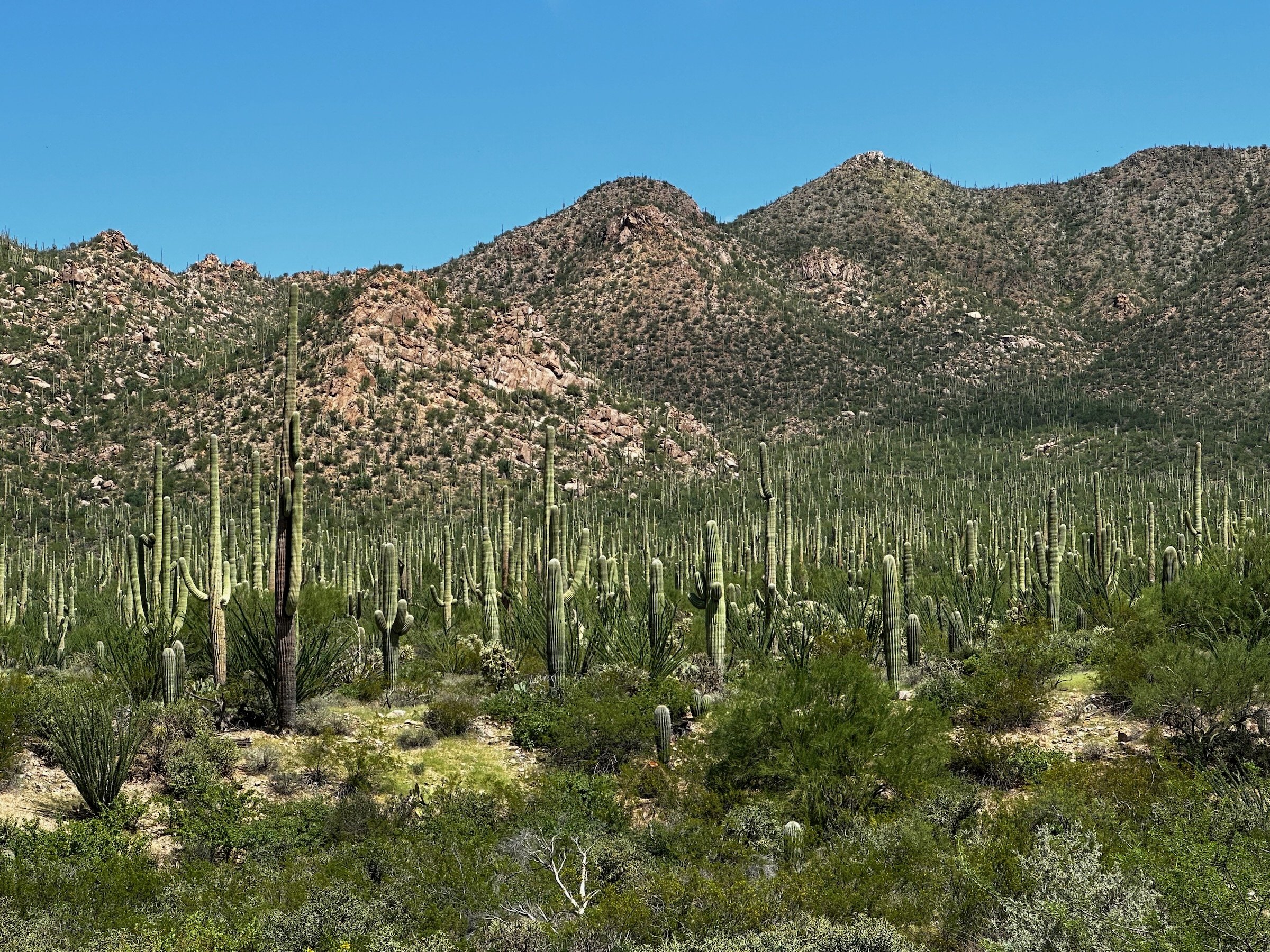
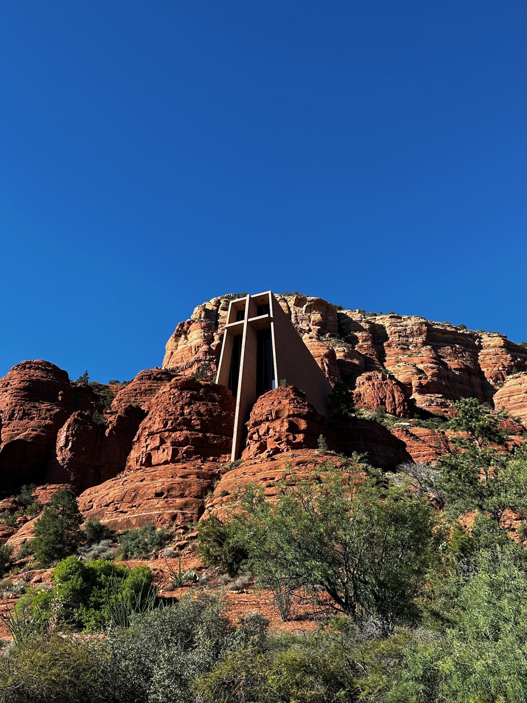
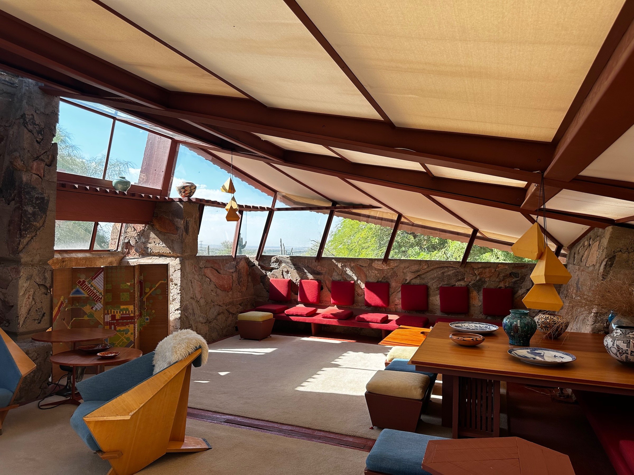
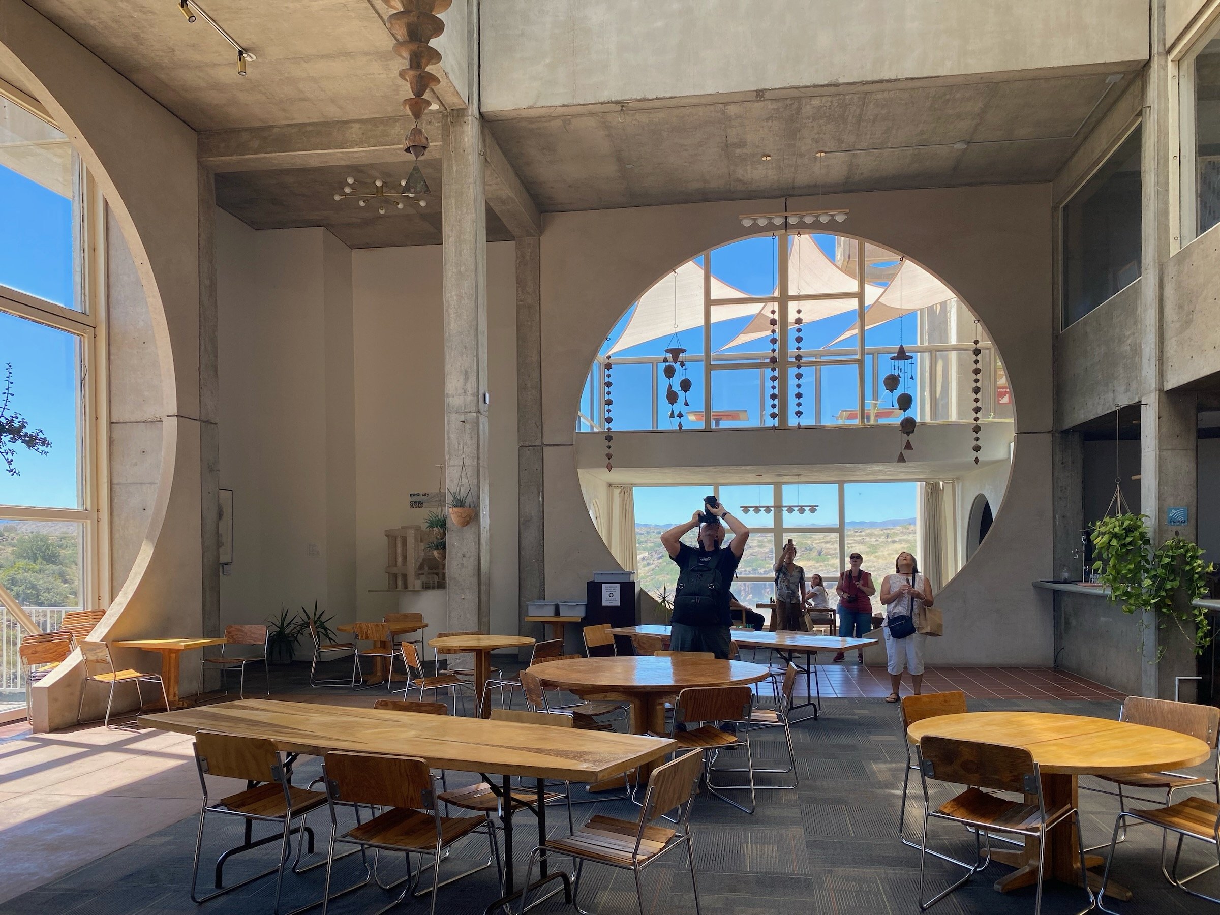
FAME Architecture & Design Co-Founders David and Marina have a conversation about their recent road trip through the southwest region of the United States. The two cover the value of local architecture, adobe buildings, the role nature has in cities, designing experiences, how architecture can co-exist with the natural landscape, craftsmanship, and more. The trip lasted two weeks with each night spent in a different hotel. Destinations included New Mexico, Utah, Arizona, Taos Pueblo in New Mexico, Monument Valley, Antelope Canyon, Frank Lloyd Wright’s Taliesin West, and Joshua Tree and Palm Springs in California.
Local Architecture
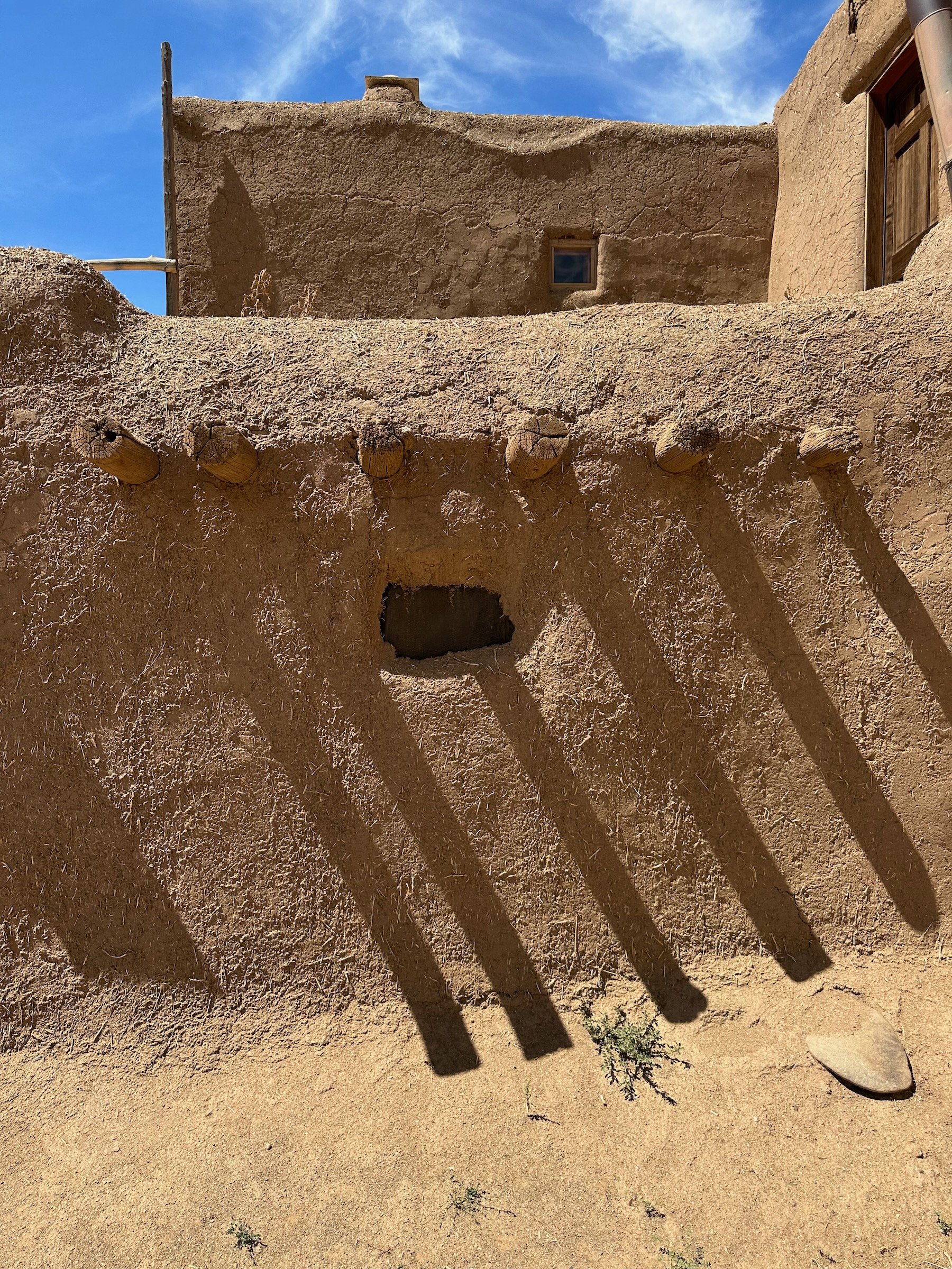
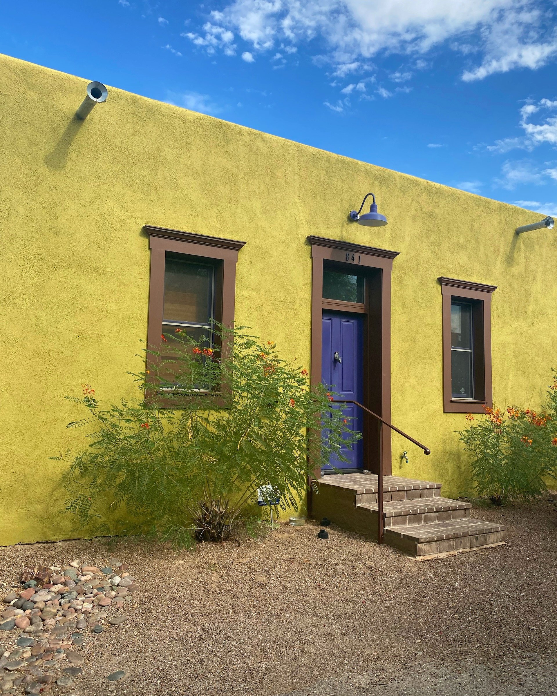
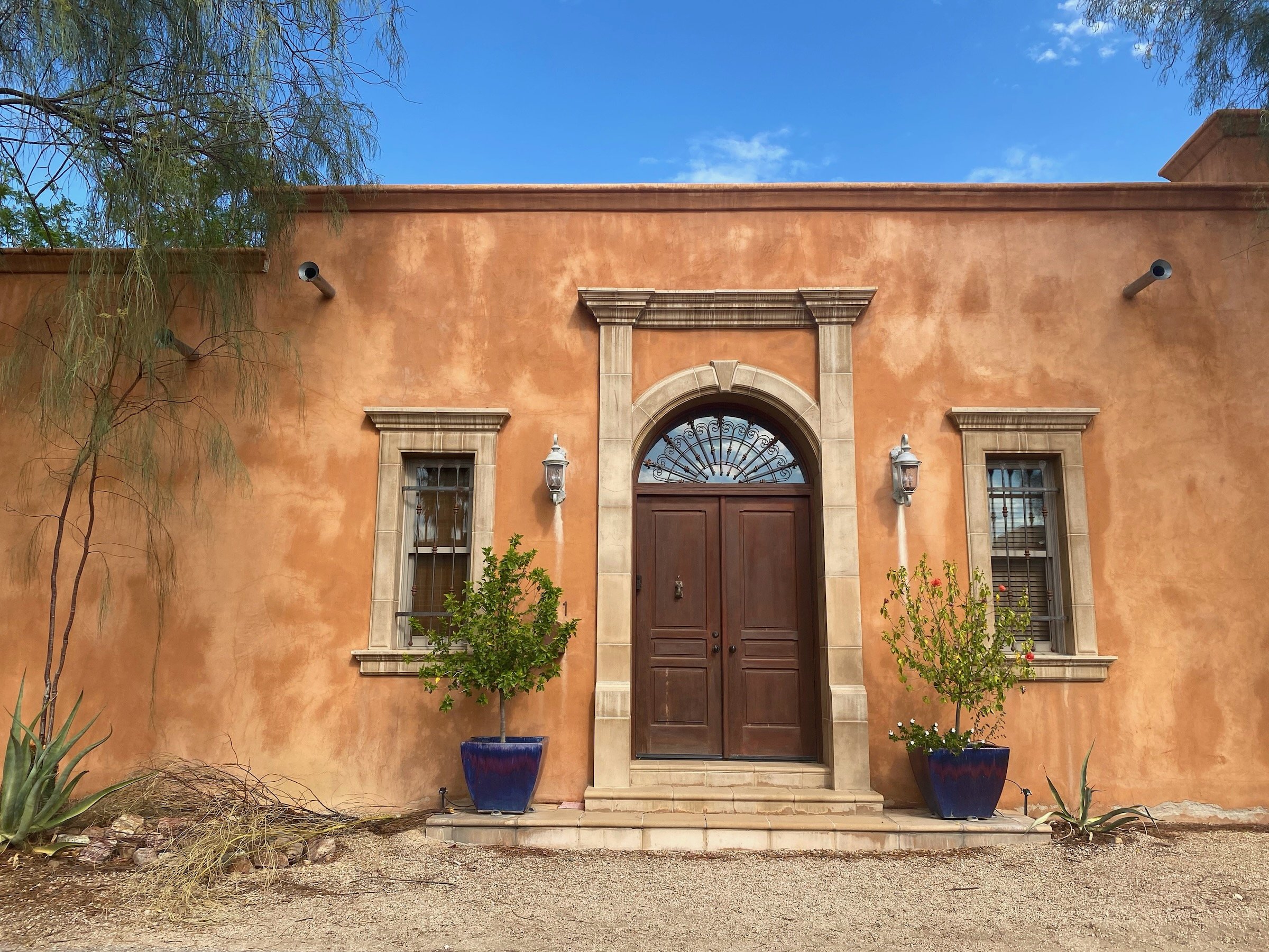
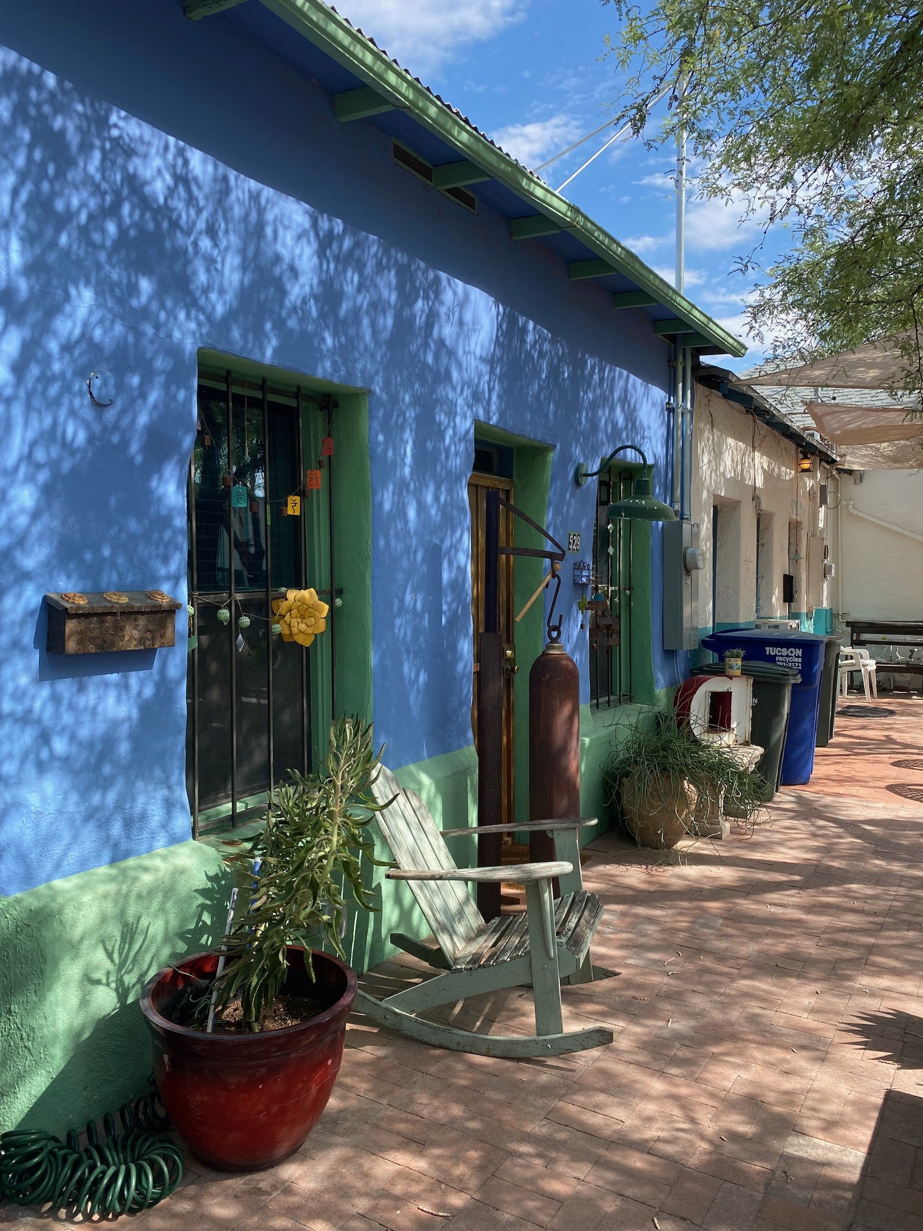
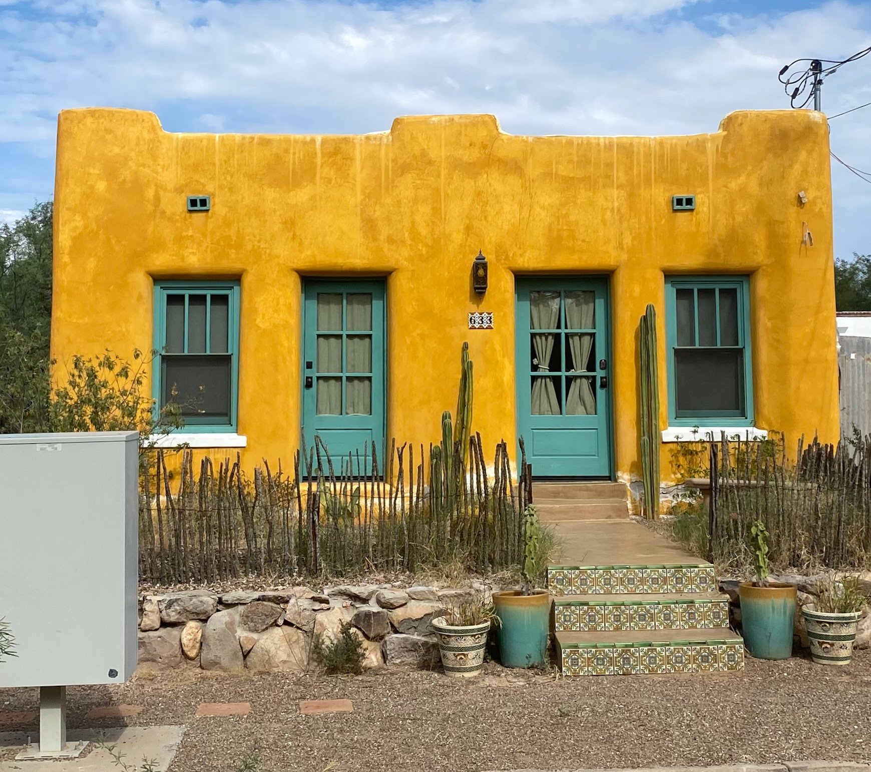
David: The adobe architecture of the southwest is fascinating not just because of how it looks aesthetically. It looks the way it looks because it was built that way out of necessity. With the adobe houses, the relationship between their structure (the thing that supports the architecture), their construction methods, and their aesthetics, and therefore their design, are one and the same. They were conceived as not separate things. That is what makes them beautiful. There's an intense honesty to that type of architecture, whether it be made with Adobe or anything else.
The challenge that we have today is that construction technology has advanced so much that we can do anything we want. So a house today is typically built out of metal framing, concrete, or often wood studs (Type V structure), and that's the structure of the home. Then on top of that structure, we layer on all this other stuff. What that means is that the construction methods and the structural design actually have nothing to do with the aesthetic part of the design. Therefore, a lot of modern or contemporary architecture lacks honesty and integrity. Because the structure, construction methods, and aesthetics of the architecture are separate, we can do whatever we want. This gives great freedom but also often causes very strange and poor decisions to be made. This ties into the idea that buildings, regardless of their construction methods, should have a soul and give a sense of place.
Marina: A very striking feeling that I had when we approached back to civilization (the big cities), it felt like we could have been anywhere. Everything looked the same. Everybody had the same cars. The houses could’ve belonged to anywhere. It didn’t feel like we were somewhere specific. It was sad. This is something that we've noticed, and it's one of my pet peeves, is that the way to build and develop many of the American cities is to have a crappy cluster of chains. There is always a Michaels, a Target, a Walmart, a Costco, a KFC, and a Burger King all within the same spot, and all the buildings that house those programs always look the same anywhere across America… except I think in Santa Fe, the McDonald's had turquoise color instead of the yellow and red.
“There’s an intense honesty to the adobe architecture”
Monument Valley vs Modern Cities
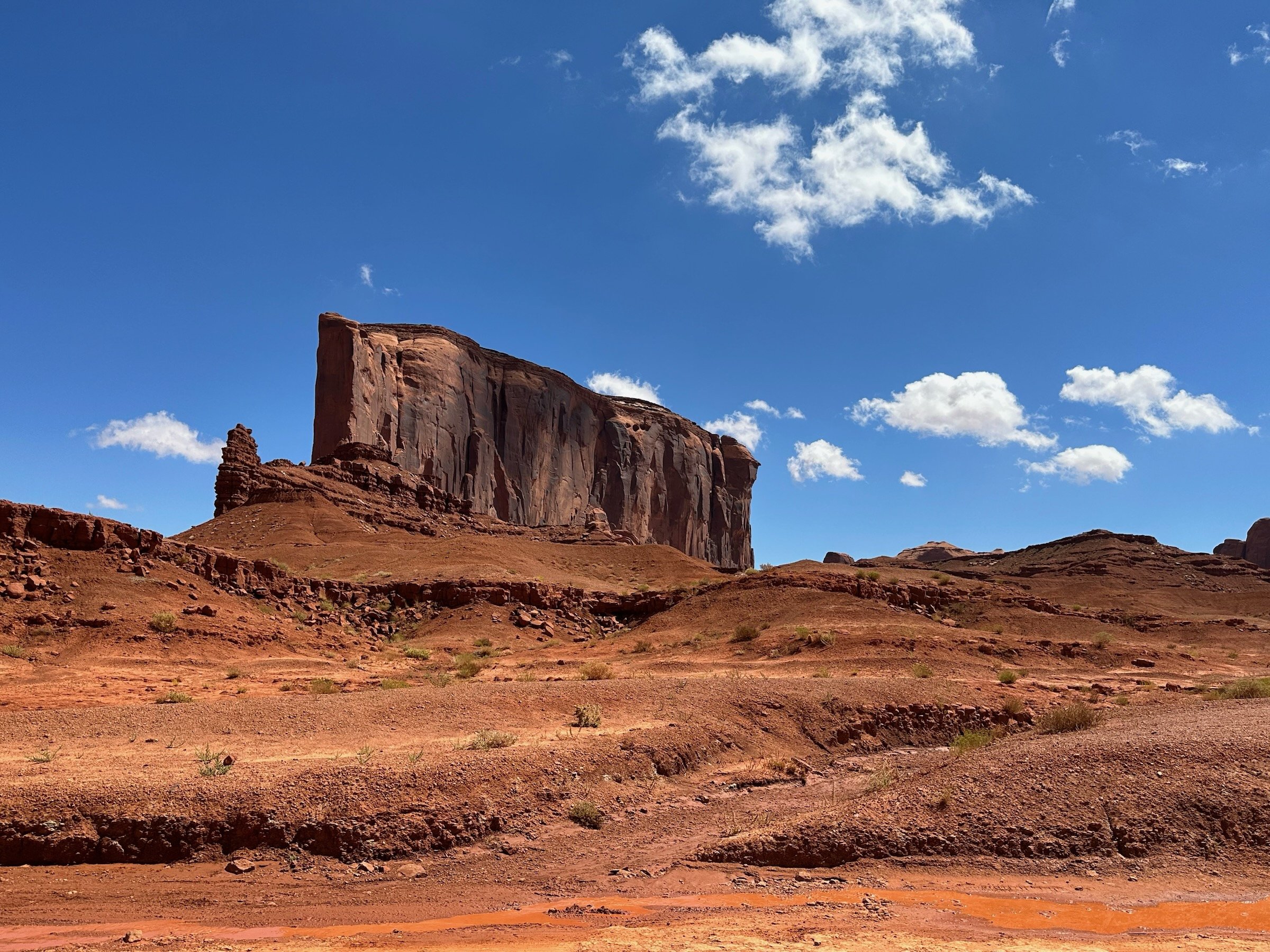
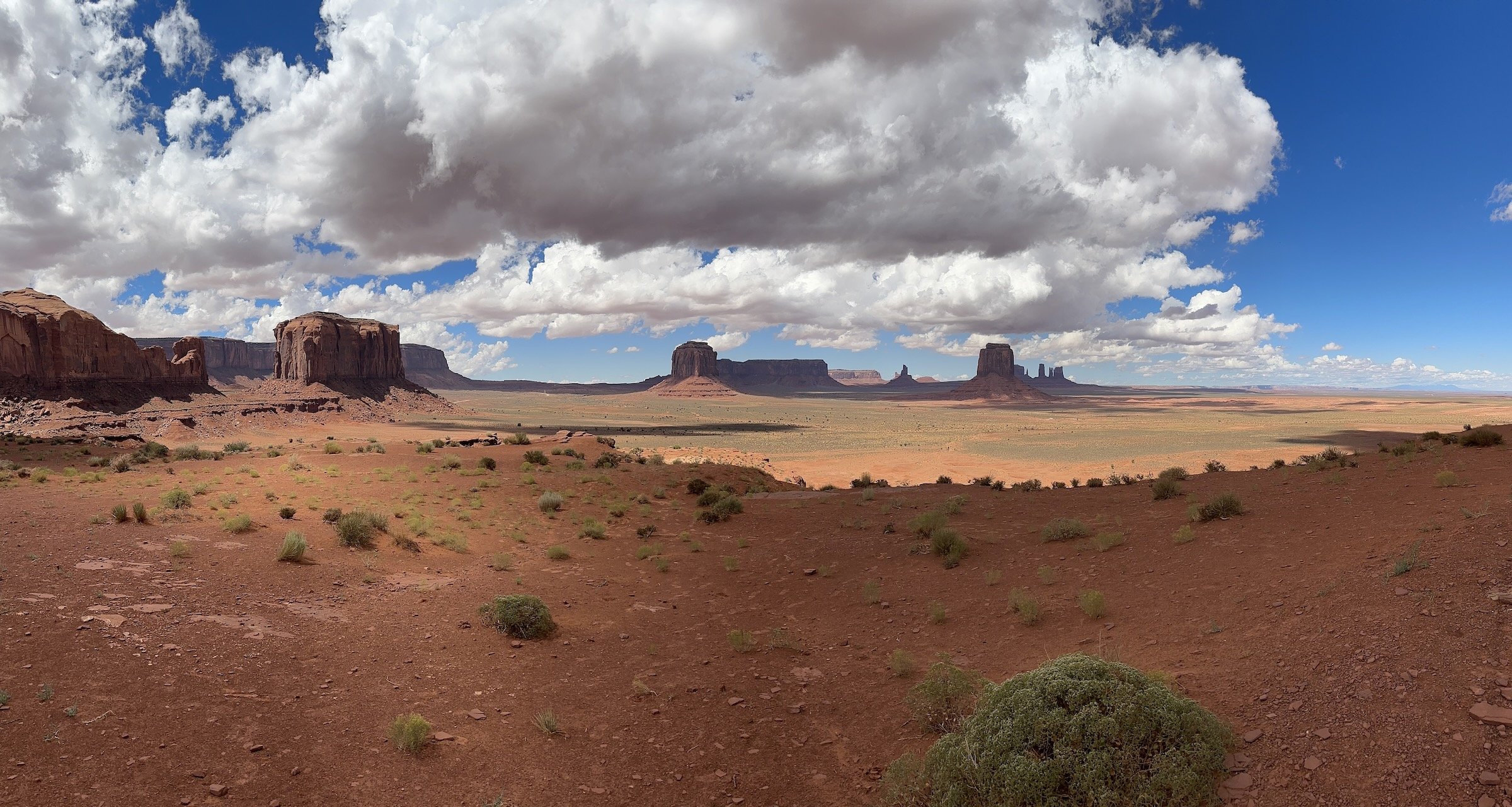
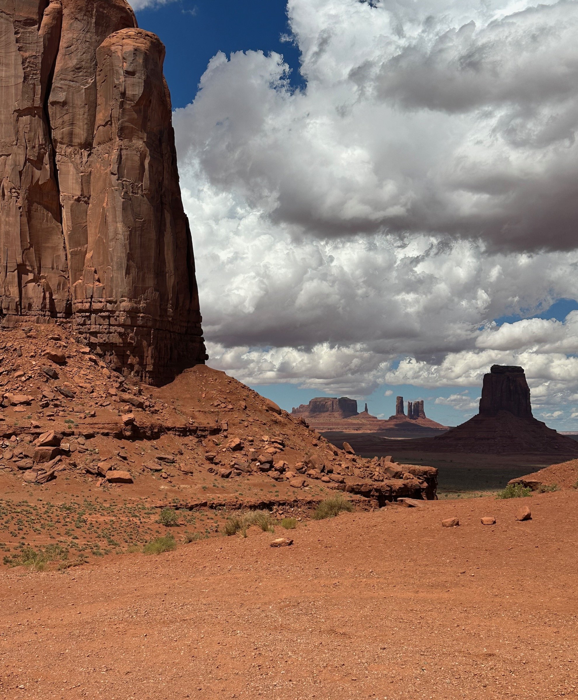
Marina: The experience of Monument Valley is a 360-degree, uninterrupted experience of nature. There, nature is the principal actor of the space, and if there is any architecture it is very much in the background. If you look at bigger cities, such as Los Angeles, you have to search for nature. Nature is in the background or it is the thing you see out of your window looking at the ocean. It is not this uninterrupted experience and perspective that makes me wonder, “What was the point of building here if we destroyed the beauty that was already there?”
Architecture In The Natural Environment
David: How should human-made structures (architecture) relate to the natural landscape around them? For us, the answer is not necessarily about matching/blending/hiding the architecture into the landscape. Instead, it's about the two being complimentary.
In color theory, if you have a green color, an easy way to work with that green is to choose another shade of green. But in color theory, there's the word complimentary, which I’ve always found very interesting. For example, green and red, you would say that they're kind of opposites, but they're also complimentary. Blue and orange, are also very different, but also complimentary. So there's this idea that two things can be aesthetically and on the surface completely different things, but they attract and they work with each other. There's a resonance between them and the two of them actually empower each other. They define a new understanding of each other. I think that's really what architecture should be doing with the natural environment around it.
Marina: It's not about blending in. It's also not about being different for different sake. It's about creating that resonance. And it might be a product of them being aesthetically very different. It's the tension between the two, that creates something really special and exciting.
David: Conceptually, architecture also defines our relationship to the natural environment. In a primitive sense, architecture provides shelter and protects us from the exterior. Because of this, it acts as a mediator between us and nature. Even if a building has no windows at all, it still conceptually frames our relationship to the natural environment. Of course, in a place like California, this idea manifests itself more visually and physically through things like windows, courtyards, skylights, interior courtyards, breezeways, etc. which literally frame exterior space and allow us to have much stronger indoor/outdoor relationships, and more sculptural forms.
“Architecture should compliment the landscape, not ignore or blend in it.”
Creating Experiences Through Architecture
David: We often say that we don't design buildings and that instead, we author and design experiences. I like thinking about architecture that way, and designing that way because it takes the focus away from that physical thing (the building) which is only a means to an end. People often focus too much on the physical and say something like, "I want this wall in my living room to be pink. Can you make a pink wall?" I have nothing against pink walls, but that's how we approach design. Instead, it's about creating that 360-degree or time-based experience from morning to night throughout the week. That is actually what we create.
I think it's very important for any architect or designer to be able to see the details, but then also see the bigger picture...to zoom in and then zoom out, and zoom in again and then zoom out again. It only takes a few minor details to be completely wrong to mess up the larger experience. An analogy would be if you imagine that you're driving through Monument Valley and randomly there's a single billboard. You'd think, "Well that's terrible. That shouldn't be here. Now I have to frame my view and pretend that the billboard is not there so I can get the experience that I want." When we are designing something, we are constantly thinking about the big picture through the details. We are also always convincing others that details matter and that if they aren’t done correctly, the experience will feel like that billboard in Monument Valley.
“We create experiences. Architecture is only a means to an end.”
Here's a somewhat controversial opinion. We mostly do houses for people and so, therefore, our clients obviously have the final say and how they feel about something matters greatly, in fact, it matters the most. However, that doesn't mean that their opinion or their desire is fundamentally correct.
Often what people think ‘beautiful’ is and what they consider to be desirable, is just based on what we have all seen a lot of or it’s based on what someone else has. People often see that someone else has this thing (a color, a material, the shape of the house, a feature, etc.) and therefore they want it too because that other person is more successful and famous. In this mindset, design becomes a copycatting game where everyone's just copying things. One of the biggest challenges clients (and architects/designers) face is to get away from that. Don't copy what someone else does. Don't want something because it's been made desirable for these superficial reasons. Instead, let's create something that is specific to the place and to you. The real challenge of designing architecture is to find some truth within it. That's really what it's all about. Having the care to create something that is honest.
If you do that, you will be the one who sets the trend and the original out of the ordinary. Clients like these are not common because it takes a lot of guts, self-confidence, and knowing oneself to go down that path.
‘Historic’ Suburban Architecture
David: The question of context, copying, and ‘fitting in’ exists in a suburban or urban context as well. People often say, "The houses in this neighborhood have a certain aesthetic to them so you should do something that fits within that aesthetic." Often my counterpoint is, "Well, I think it's a real stretch to call this neighborhood historic simply because it's been around for maybe 50 years. Historic is relative, but in my mind, historic architecture means the 17th century. If we're talking about something that was built in the 1950s or 1960s in the United States, then it's old, yes, but it's not historic and their age mostly means that they don't perform construction-wise or thermally by today's standards." On top of that, a lot of those houses are just ugly. They're not beautiful. They were made cheaply and were poorly constructed. They were fast buildings done by a developer. So why are we saying we have to work with them?
Not every new building needs to work seamlessly with everything else that's around it. Part of what architecture, in the broadest sense, should do is push conversation and the evolution of design and architecture, and, therefore, culture. You can't do that if you're always just referencing the past. That's also why I don't think creating great architecture is only about how things look visually. It's about other aspects of design, which a lot of times are the more invisible aspects of architecture that have to be understood and respected.
Craftsmanship & Love
“I think if you put love in what you do, you can transfer that love to people”
David: If you drive through the hills of LA, there are houses and properties that are worth tens of millions of dollars and they're dogshit. They're not good houses. They're not good design and they're oftentimes poorly built. We come across people who buy houses for let's say $8 million. And I think to myself, "Why? Why did you buy this?" The answer is that because every other property in that neighborhood is worth that amount and of course, there's also the bedroom count and a square footage count, but those are all just quantitative things. If you actually look at the quality of the thing you bought, the design of the property, the landscaping, and the house, not worth it. Not even close.
Marina: I often feel that craftsmanship has been lost. Meaning, how much care you put into something and how much care you put into making something good, and not just doing a quick deal to make money and move on. Architects can also be considered craftsmen. I'm always thinking about Europe as a point of reference, and in small towns there, people make their own things and they are very proud of that. The local guy who makes bread or the local cheese shop is passionate about what they do... they are craftsmen. Even the signage above the door of the cheese shop would probably be hand-painted and they would've picked the colors very carefully. I think if you put love in what you do, you can transfer that love to people and create more love around you.

